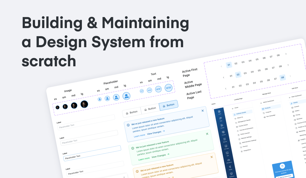
Problem Statement
Designers were spending significant time explaining their designs & decisions , which impacted their efficiency & productivity.
The current product also lacked design consistency , which impacted its usability & overall effectiveness.
Project Outcomes
Quantitative evidence:
• Designing time for any feature: reduced by more than 50% when started using these components
• Developer handoff & explanation time: reduced by more than 20 minutes for each of the designs that I create
• Having consistent design throughout all the features in the product which also helps in brand guidelines
• Next steps: understand more about tokenization, give better documentation with more examples, collaborate with the devs & give best practices, do’s & dont’s on how to use each of the components
Design System Talk
Also gave a talk at the company regarding Designs Systems. Have look at the slide deck here:
Design System Talk by Ashwin K SChallenges
• With over 6,000+ paying tutors, there was a lot of customer dissatisfaction with the designs and UI. Making it consistent by thinking long-term was a big challenge
• Had many features in the product, and also had admin platform & student platform for the product. Designing components with having clear guidelines, unifiying designs & providing best practices for teams was a huge challenge
• The project did not have a dedicated timeframe. In addition, no buy-in process was in place for building it. Designed and built everything to make developer hand-offs as easy as possible
• While there was not complete freedom in setting up everything, brand colors and typography decisions were already made, but even those decisions were applied randomly by any designer who worked on the designs.
Roles & Responsibilities
• Try to understand as much about the product as possible before jumping directly into creating components
• Create a basic audit of components with inconsistencies with respect to designs
• Designing components with clear guidelines, unifiy designs & provide best practices for teams
• Create a basic documentation for each components & provide design for different variants for each component along with the interactive prototype for the same
• Include edge cases for all the components like error states, disabled states, etc.
Project Timeline & Design Process
1. Product Understanding & Audit
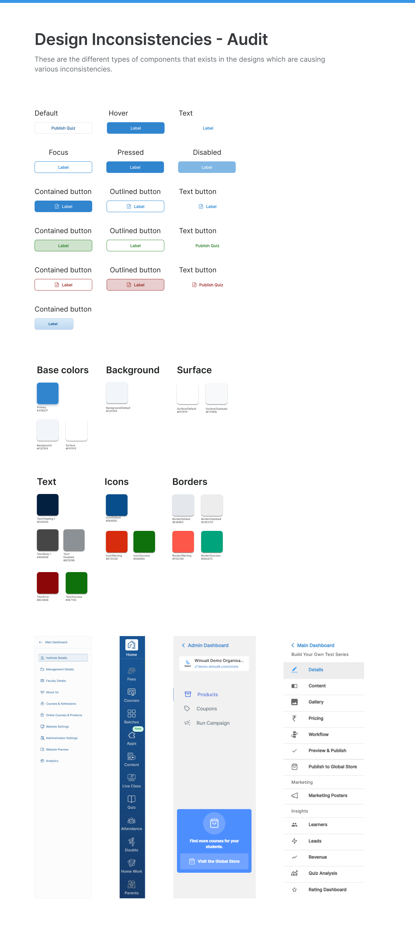
• Since many designers had designed different features on the product, the designs for the entire product was pretty inconsistent
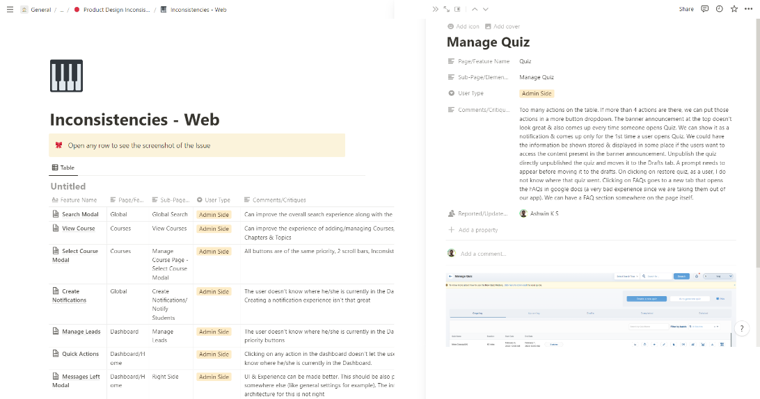
• Trying to understand and do an audit of basic inconsistencies in the product (thinking also will be useful when needing buy-ins)
• Writing down all the design inconsistencies & how we could design better using differnt design patterns for all the features in the product
2. Design System Research
• Based on the product understanding & audit, it helped to arrive at the conclusion to create a basic documentation for each components & provide design for different variants for each component along with the interactive prototype for the same
• Also, I studied a lot of Design Systems implemented by companies to understand how I could design one for our products and audience/users
• Here are the Designs Systems / UI Kits I referred in order to create the Design System:
• Align Design System - by Urban Company
• Ant Design Systems
• Google Material Design System
• Untitled UI Kit
• Lightening Design System - by Salesforce
• Tailwind UI Kit
• & many more
• I also joined a course - Figma Academy: by Michael Riddering (knowns as Ridd) to understand how I can use the power of compnent to design faster & better
3. Listing out components to be designed
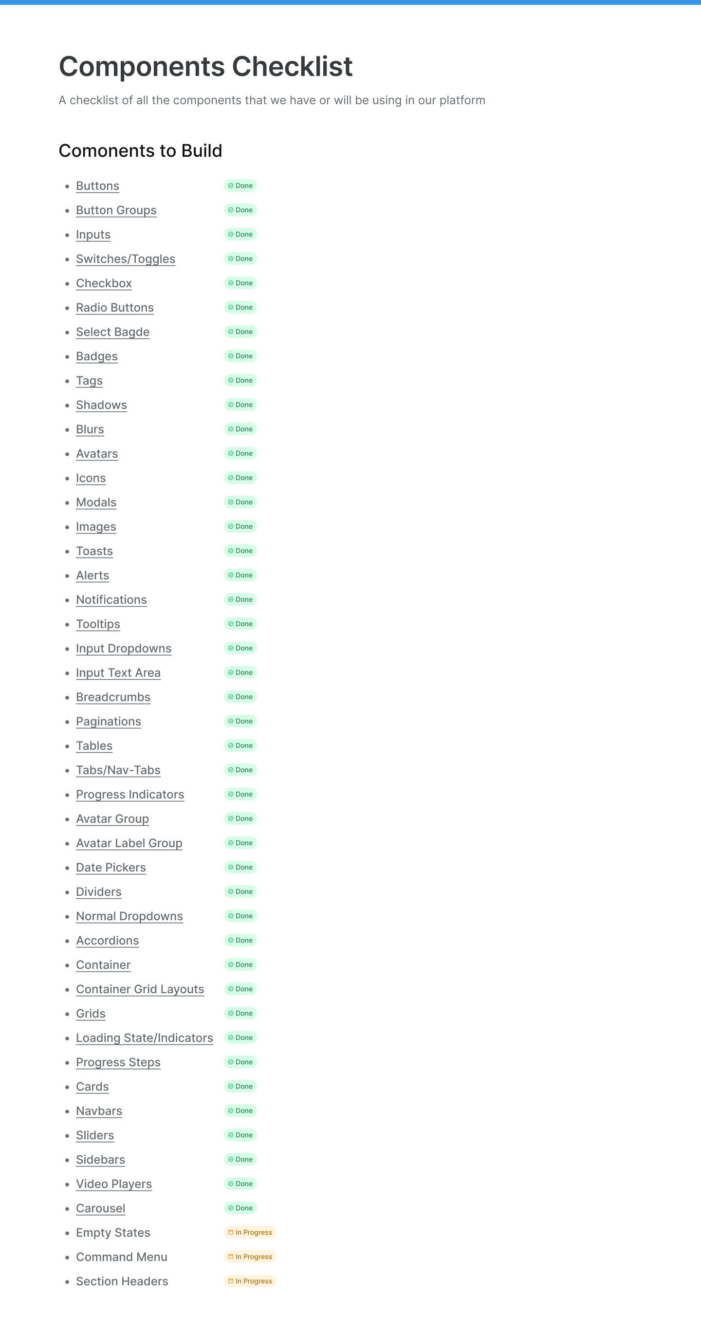
• After I studied various Design Systems, listed down all the components I need to design that have been used somewhere in our products
4. Design Exploration - Designing Components
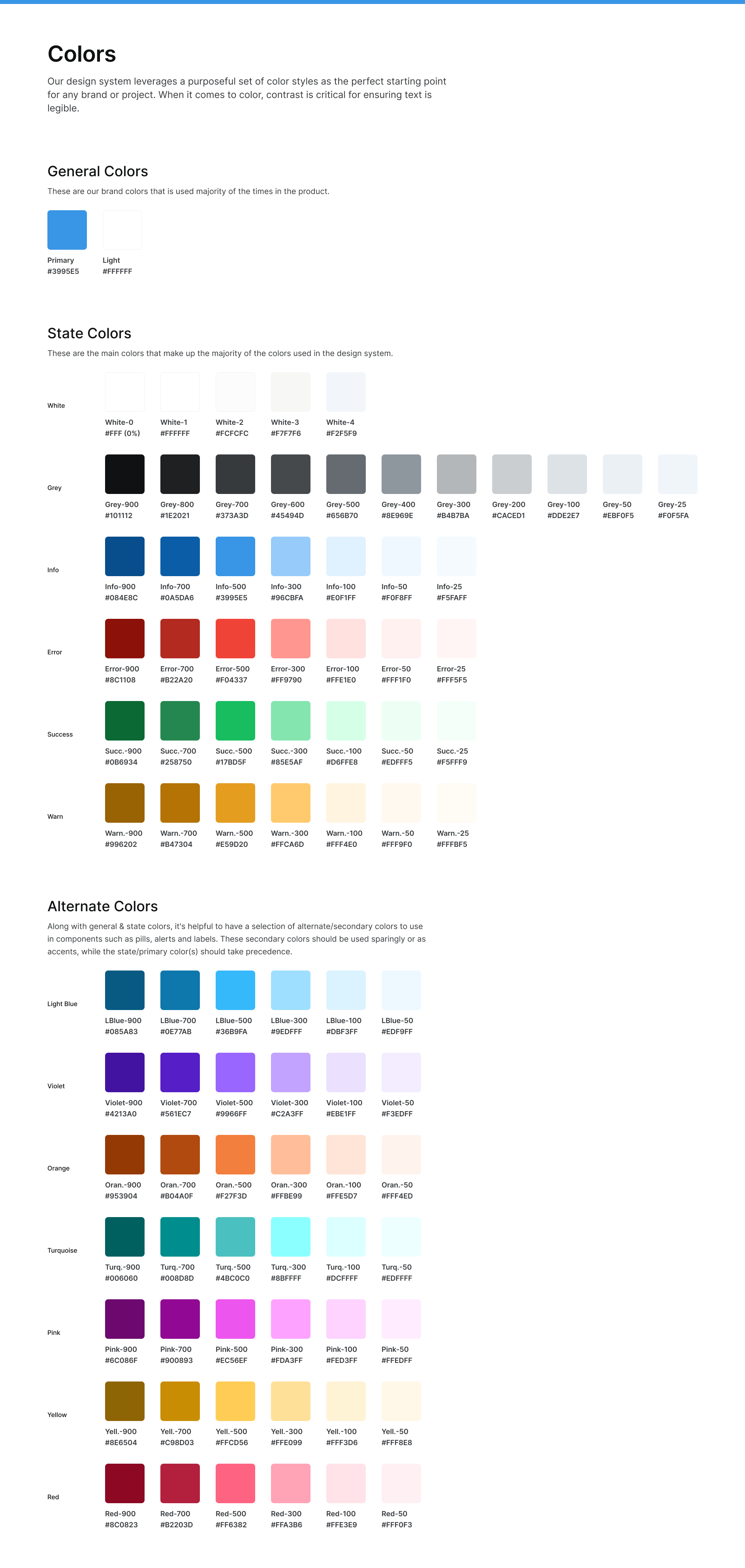
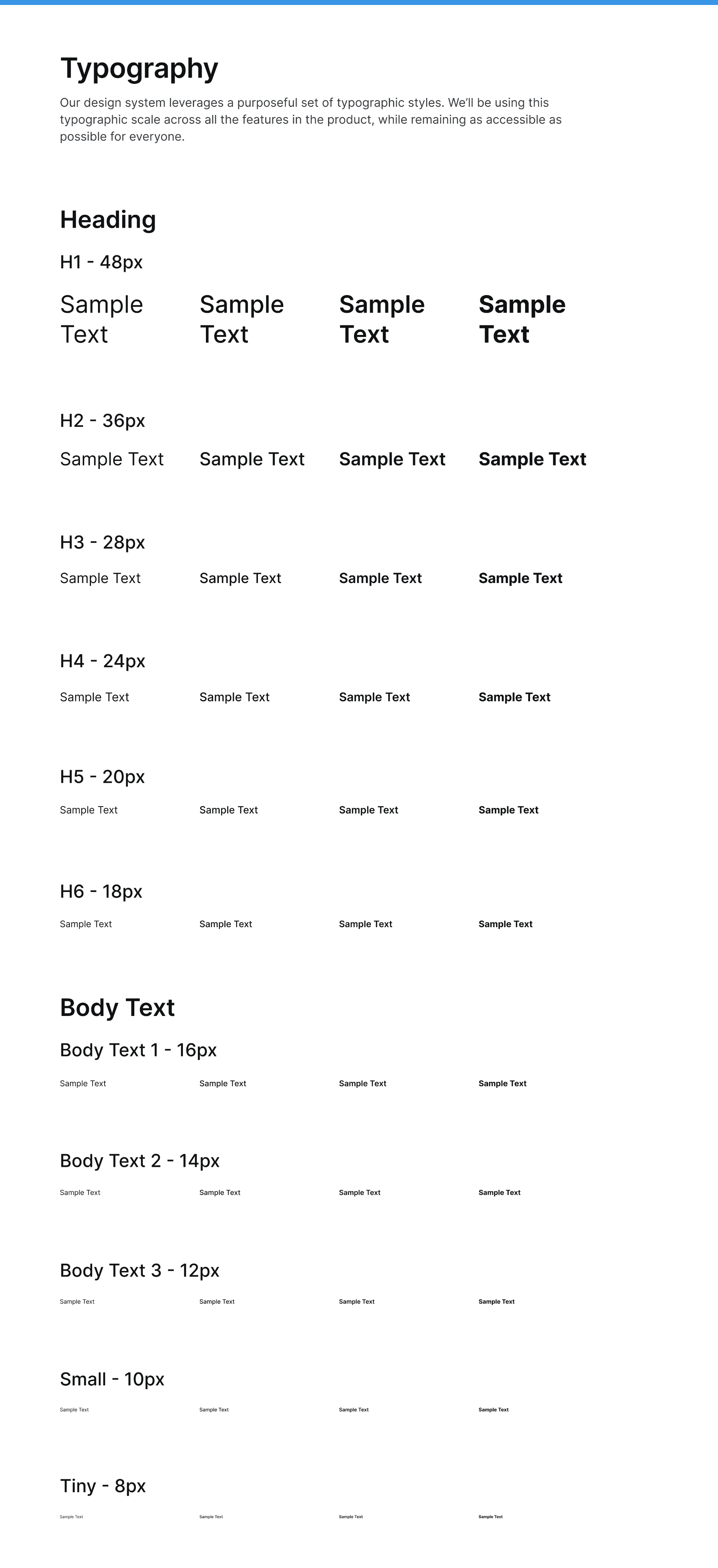
• First I created color styles & typography styles as even these weren’t set in the product properly. For colors, create different shades & tints & gave them names/aliases for having easier conversations with all the teams
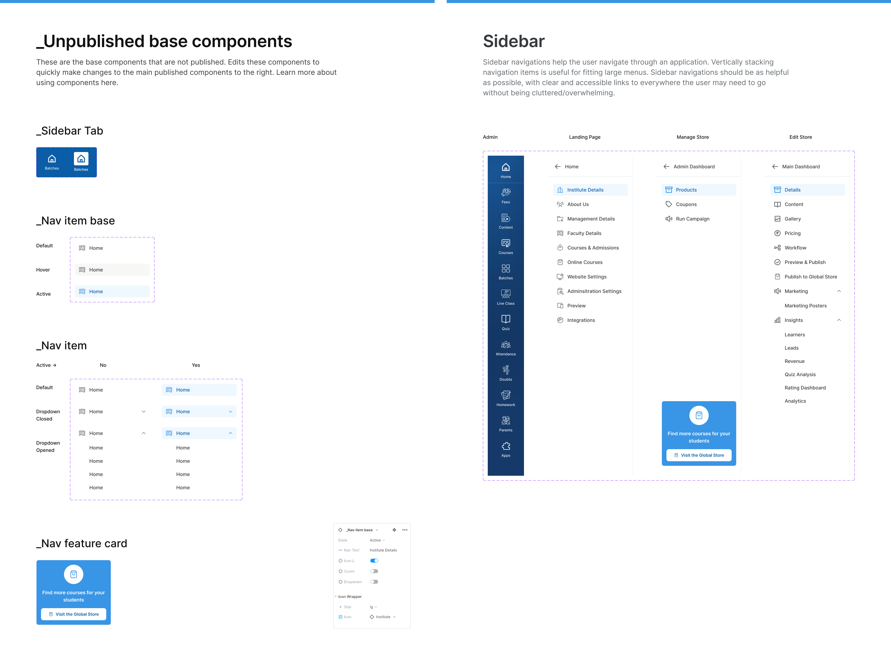
• Based on the list, I started design compnents. Used the learnings from Atomic Design (book by Brad Frost), & started designing the most basic components
• By the time I had designed my basic components, Figma released component properties feature through Figma Config 22’. So, adopted these to use the power of component properties for these basic components
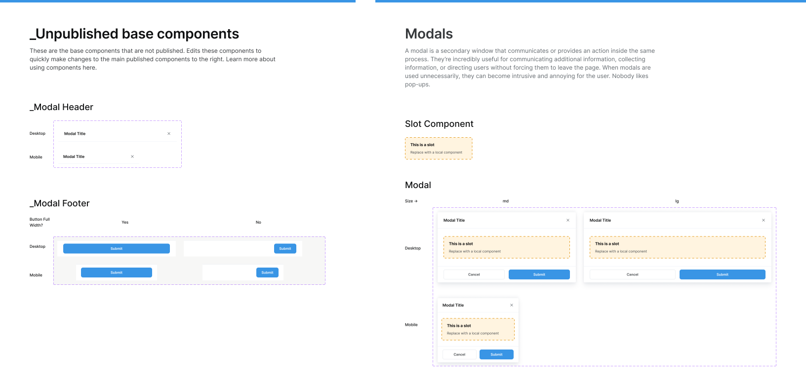
• When started designing on a bit complex components (molecules), designed those components in a way where each component will have nested basic components (like using first principles)
• Used to same concepts to build even the most complex components
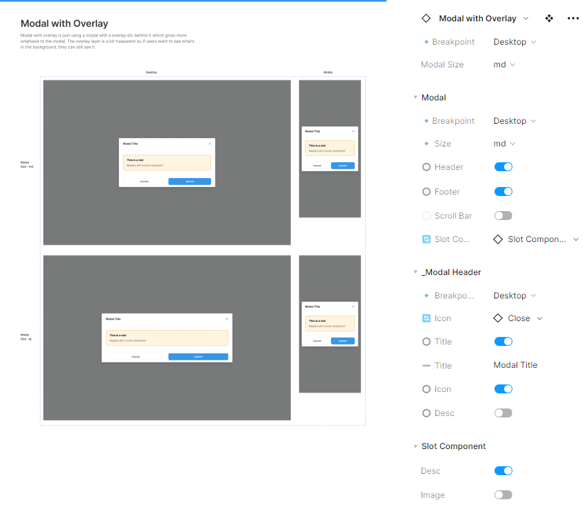
5. Prototyping to make interactive components
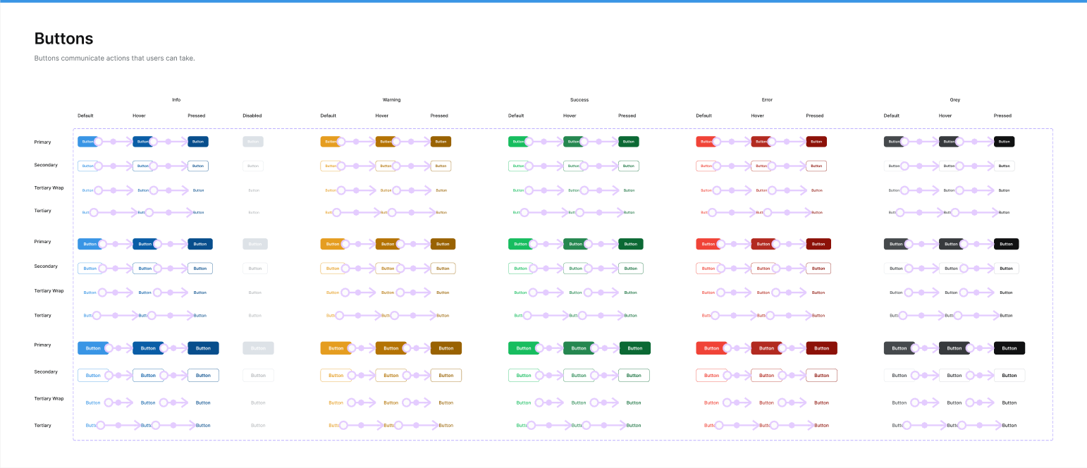
• When designing for different states for each of these components, I started protoyping them to make it interactive
• The main purpose of creating these interactive components was to make prototyping easier & have less number of frames when prototyping
• While prototyping these components, realised that I had missed out on some of the states/variants for some components & designed for the same
6. Provide Basic Documentation
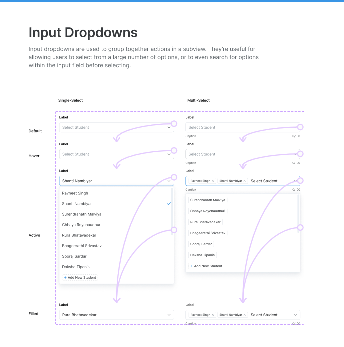
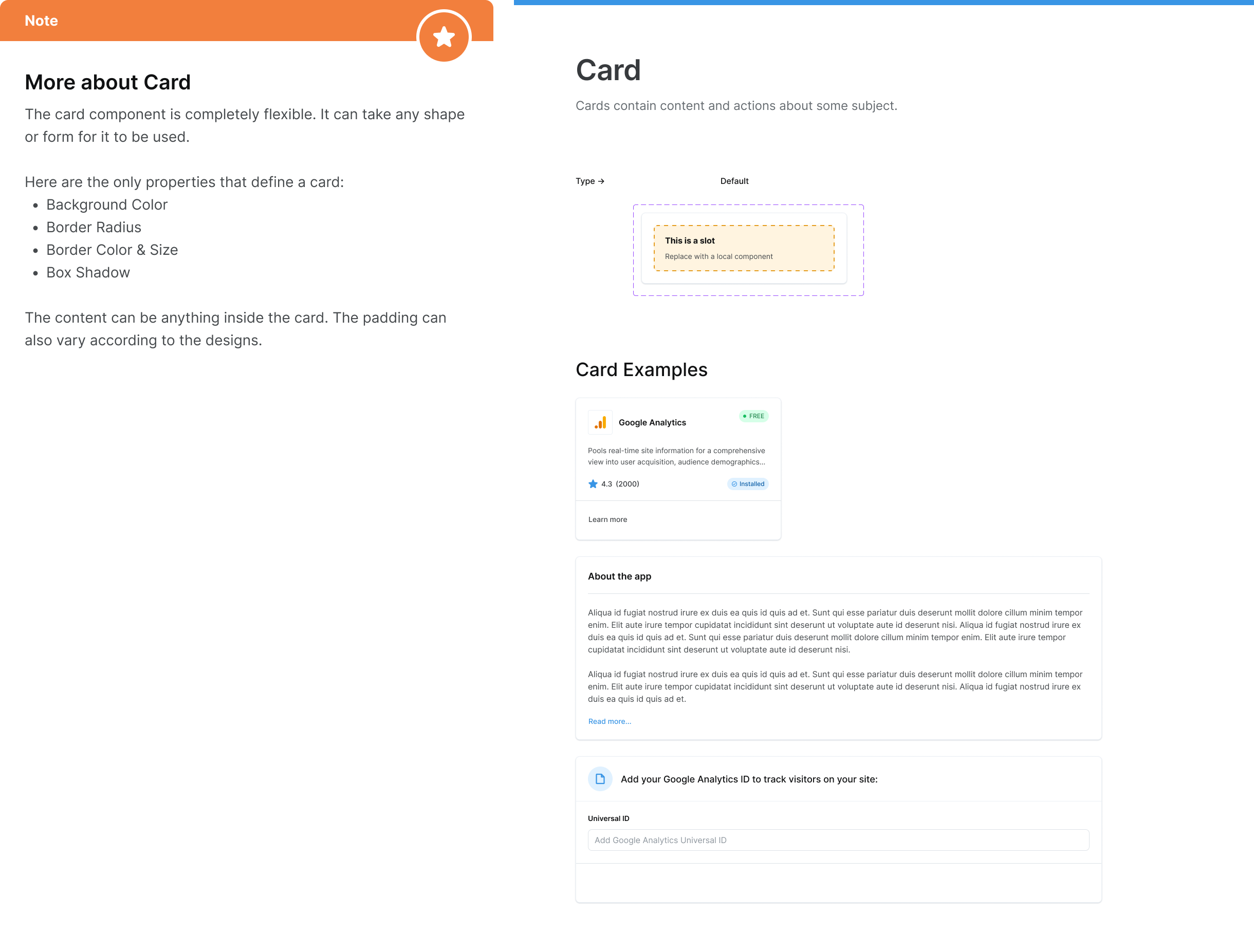
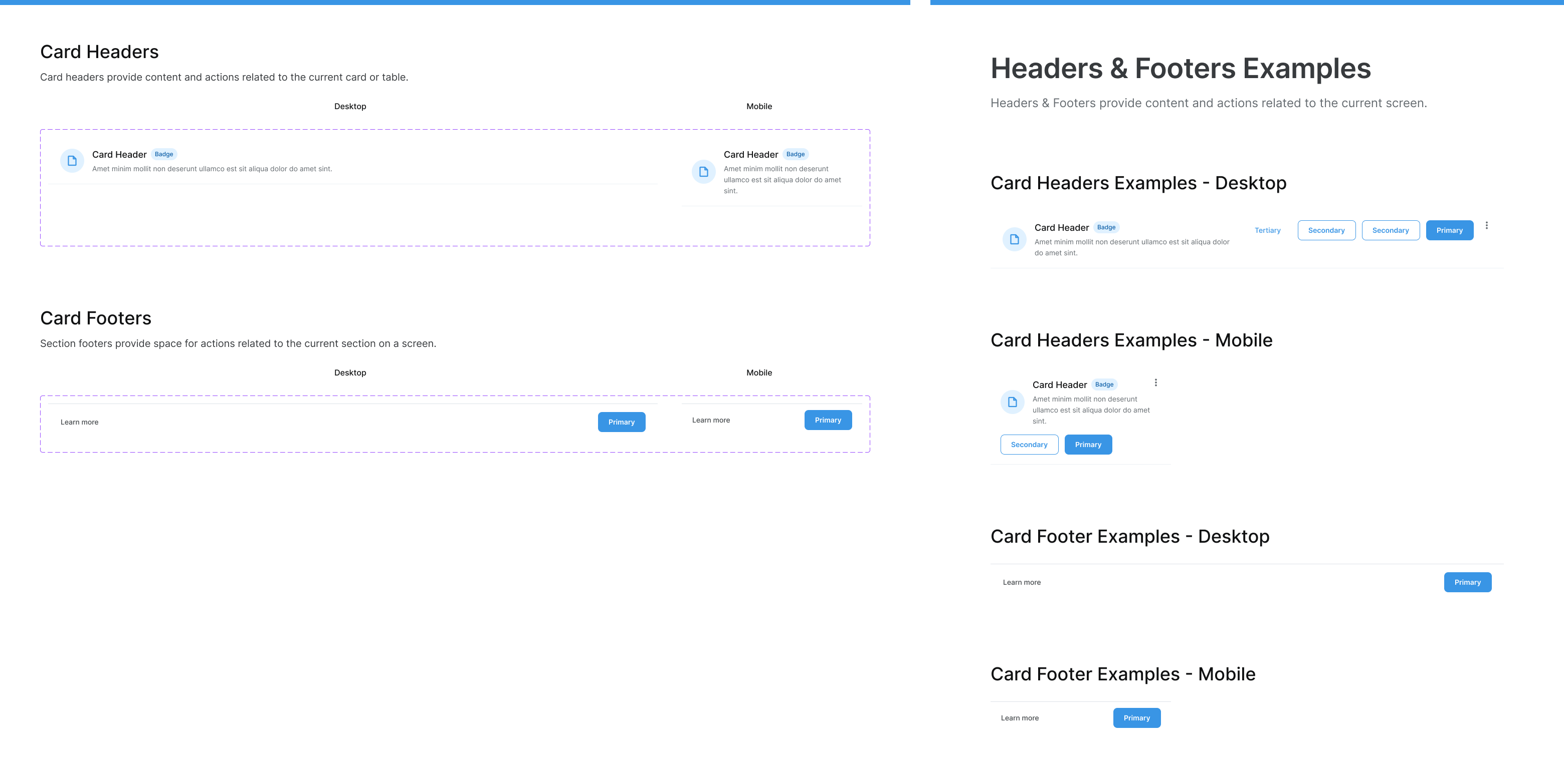
• After designing components & also prototyping it to make it interactive, created basic documentation & named each of the different variants to make the hand-off process easier
• Also provided with examples of usage whereever possible to gain a better understanding for whoever will uisng these components while designing or developing
• Think about tokenatization of the components as well. Though haven’t used any plugins/tool to provide tokens for the developers, have created components in such a way that, it can used as a token anytime (For eg, rather than having just icon components, have created an icon wrapper component with different sizes which acts as tokens)
Key Learnings
• Designing an entire Design System for the first time. Learnt a lot of new concepts like interactive components, nested components, slot components, tokenization, etc.
• Understood when & when not to use component properties & also understood using more of base components for complex components
• Understood how to design & use gloabal components & local components & how to integrate everything while designing screens for any feature in the product
